Overview
Duration + Tools
Project Breakdown
4me Gluten Free, an Australian bakery specialising in gluten-free and allergen-free desserts, stood out to me due to its suboptimal website design when I went to order a cake for a friend.
I absolutely LOVED their desserts however XD
4me Gluten free’s website contained a lot of (if not too much) information which is a good thing as well as a negative feature.
The layout was confusing, and the structure would throw off the users within a matter of seconds.
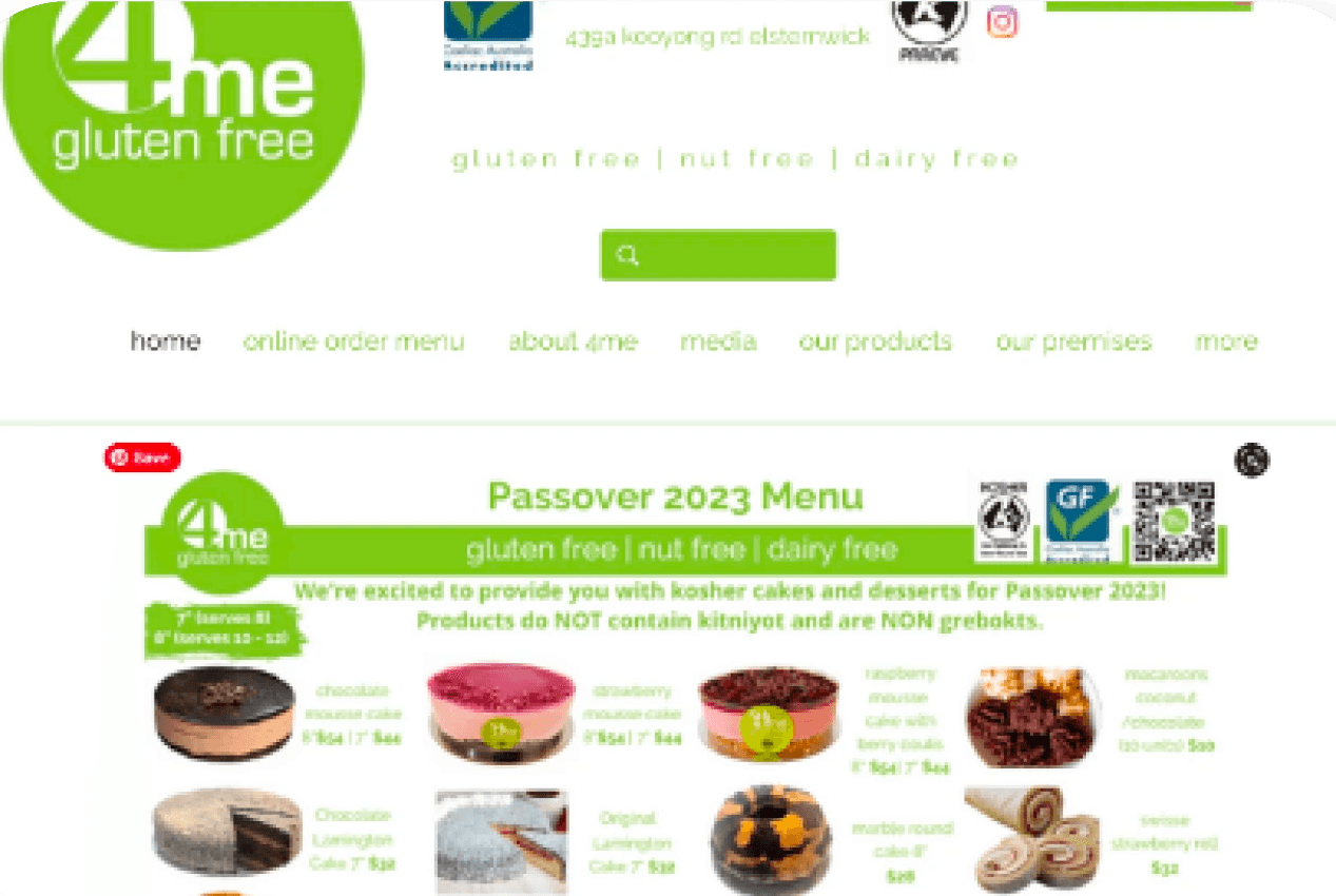
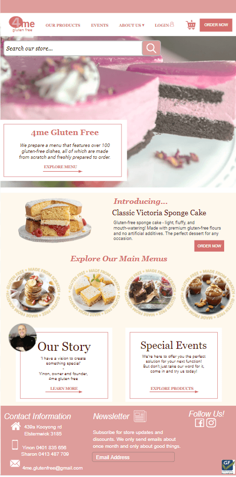
The image below is the home screen of the client’s website that you would see as a user.
As you can see, there is a lot of information on this page that is either irrelevant to the home page, missing or misplaced. The layout is confusing, and the structure can throw off the users within a matter of seconds.
By making the design more visually appealing and user-friendly, I believed that customers will find it easier to navigate the site, access information about the bakery and its products, and place orders.
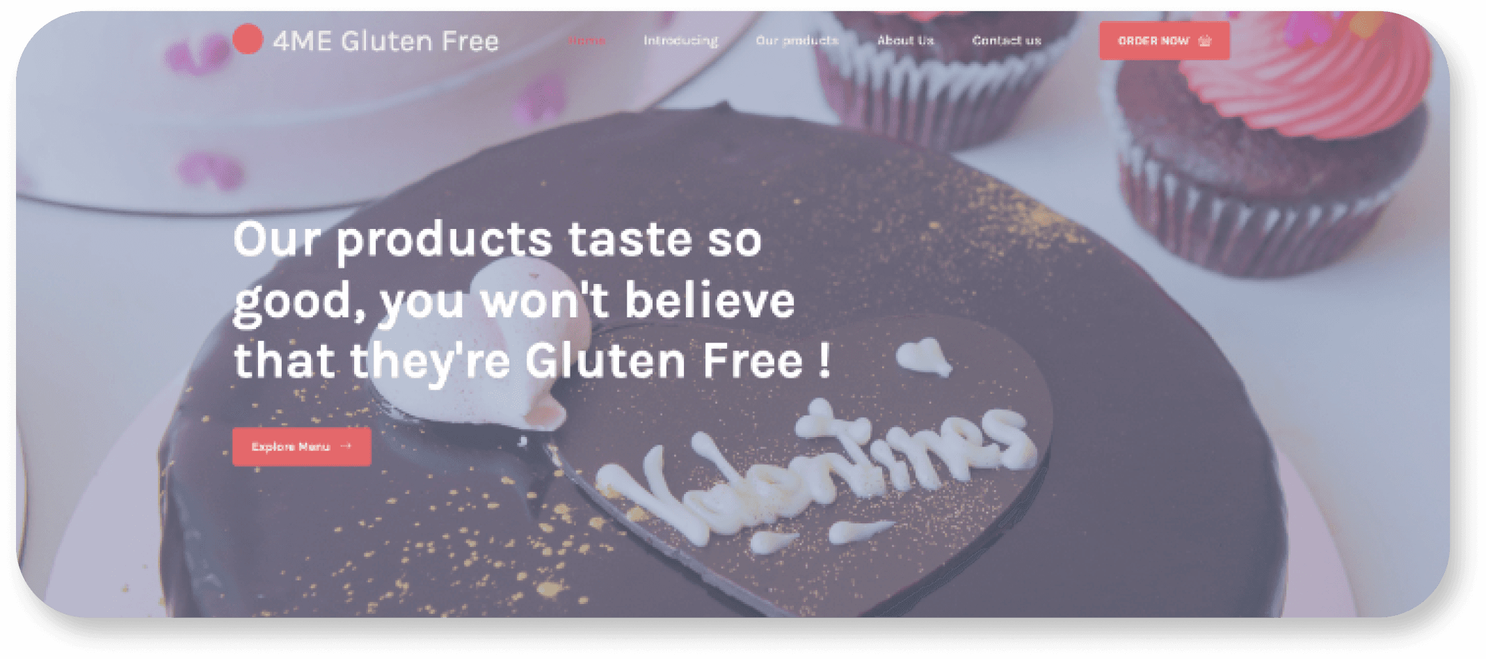
Below is my first mock-up of the website redesign made with Canva
A lot of features in this mock-up make it more visually appealing, user-friendly and easier to navigate while keeping the original content and still maintaining minimalism.
Afterwards, in the development process, I strived to reach this level of functionality and keep it looking as close to the mock-up as possible.
Design Choices & Development
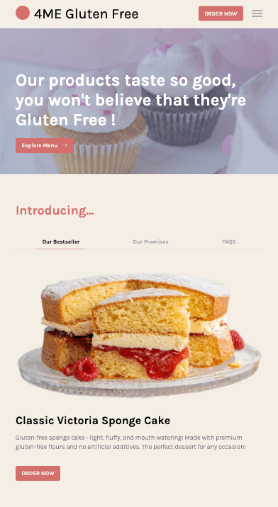
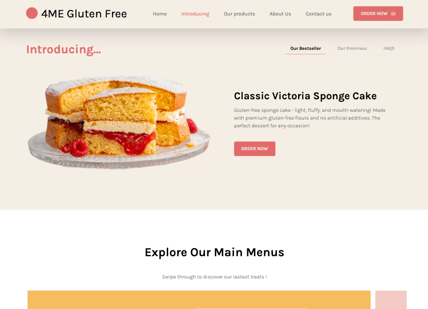
The first mock-up I created displays a redesigned homepage for “4me” with a refreshing web palette of soft pink and beige.
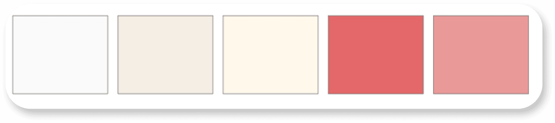
My intent was to make the proposed website as similar as possible to the design mock-up so I implemented the soft beige and pink palette from the mock-up and a couple more colours for contrast. I believe these definitely enhanced the overall visual aesthetics of the webpage. Some examples of the colours are shown below.
As for the text, I kept the original font style of the website as it was minimalistic enough for me. I did make some minor changes to the font sizes and weights where I thought necessary.
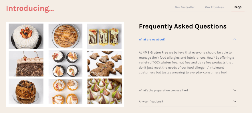
I also implemented colour-changing anchor links for easier usability.

The Navbar changes to a solid colour when it user scrolls past the hero image and now has direct links to different sections of the home page.

The adjustments I made to the website design were based on the latest industry standards and best practices, ensuring that the prototype is up-to-date, functional, and attractive.
Below is the screenshot of my final design landing page in mobile view.